


Case study
Responsive web
Redesign
Overview
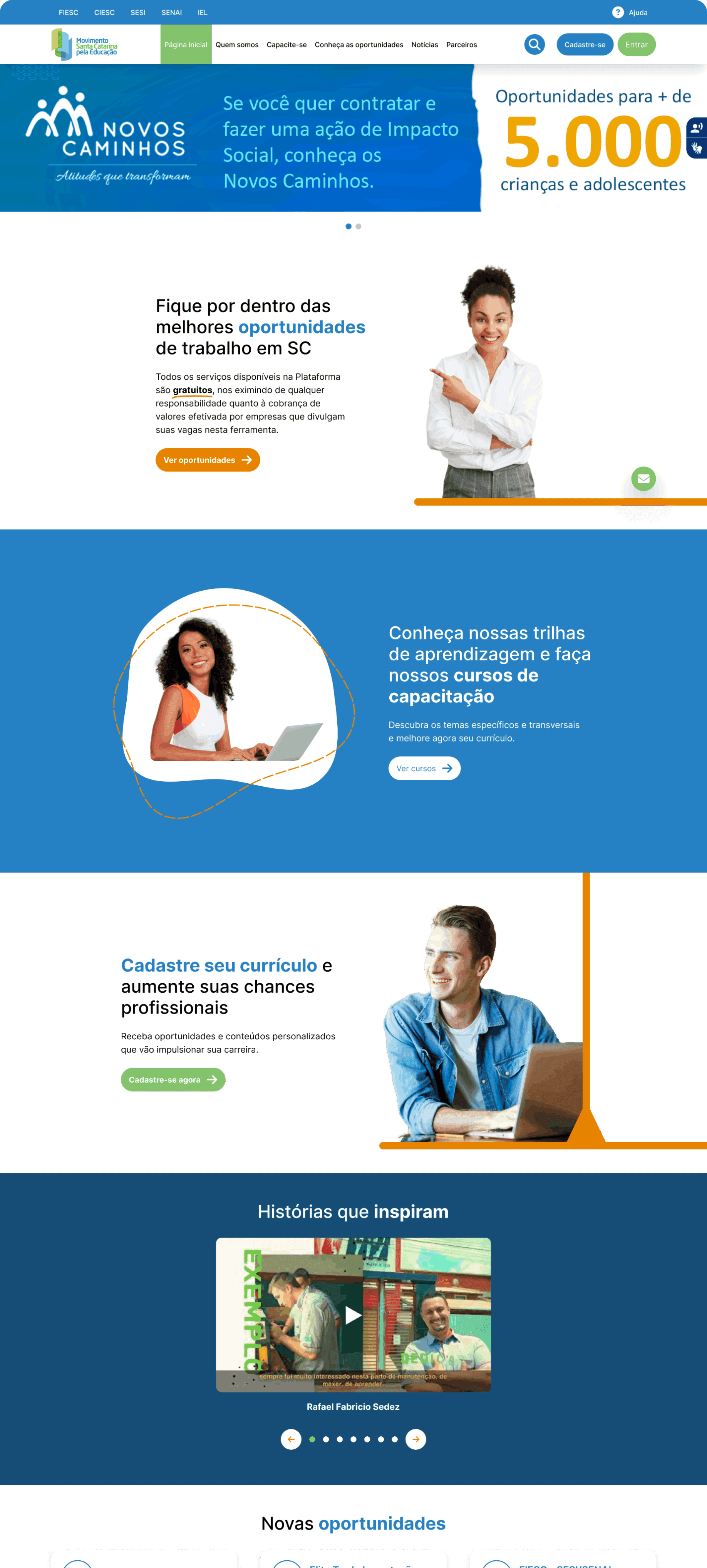
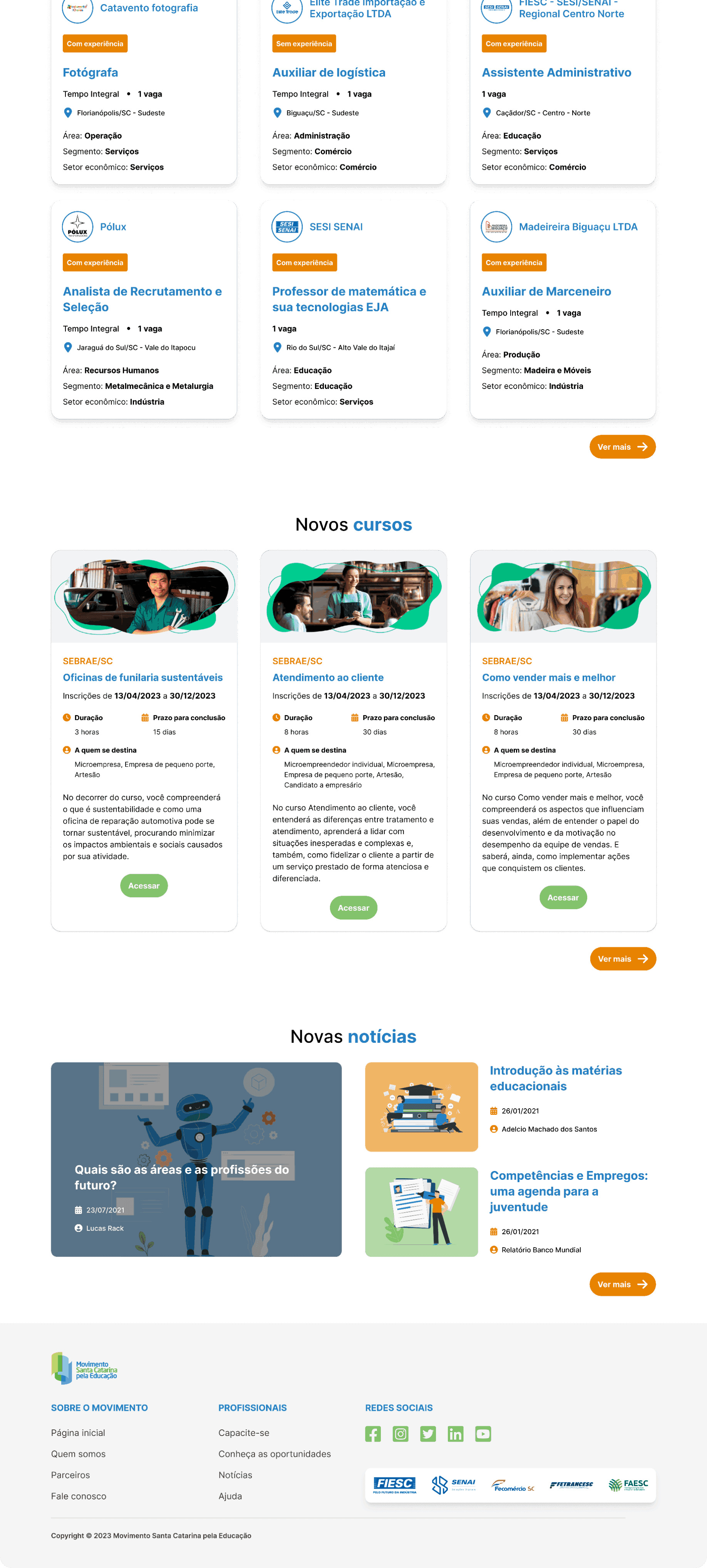
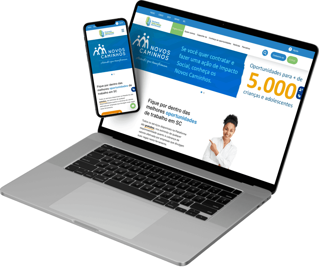
This case refers to the redesign of the homepage of the Movimento SC website.
Performance
UX/UI Designer
Duration
1 week
Tools
Figma
Category
Responsive web design
Considering the homepage of the site Movimento Santa Catarina pela Educação (https://movimentosc.com.br/), identify the main points for improvement based on good practices of usability, interface, and user experience. From the analysis, build a web and mobile prototype that applies interface design principles, such as visual aesthetics, information hierarchy, appropriate use of grid, colors and typography, spaces, and accessibility. Furthermore, take into account usability principles, such as ease of use, clarity in interactions, and efficiency in task completion to justify improvements along with the organization of colors, typography, and components.
For this challenge, the Double Diamond method was applied, consisting of 4 stages:
Discovery;
Definition;
Ideation;
Delivery.
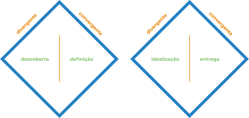
This method was chosen because, although it is a challenge that consists of only one screen, it is necessary to understand the vision and opinion of other users, who may see other usability and aesthetic issues that we might end up overlooking.
During the discovery phase, analyses, research, and tests were applied in order to better understand what the problems are. In the definition phase, the solution proposal was made and the initial drafts of the prototypes began, with the wireframes and the medium fidelity. In the ideation, the final high-fidelity version of the solution was prototyped, and finally, in the delivery, the components were organized and categorized so that the handoff to the developers could be carried out.
🔎 Discovery
Analysis of the current page
The first step to better understand the platform was to access it with its target audience in mind, which is predominantly composed of:
Workers from Santa Catarina interested in increasing their education and professional qualifications;
People looking for job opportunities and wanting to qualify for the job market;
Companies seeking new talents to integrate their teams and valuing professional qualifications;
Human Resources professionals looking for solutions for training and development of their teams;
Young people seeking their first job and learning opportunities.
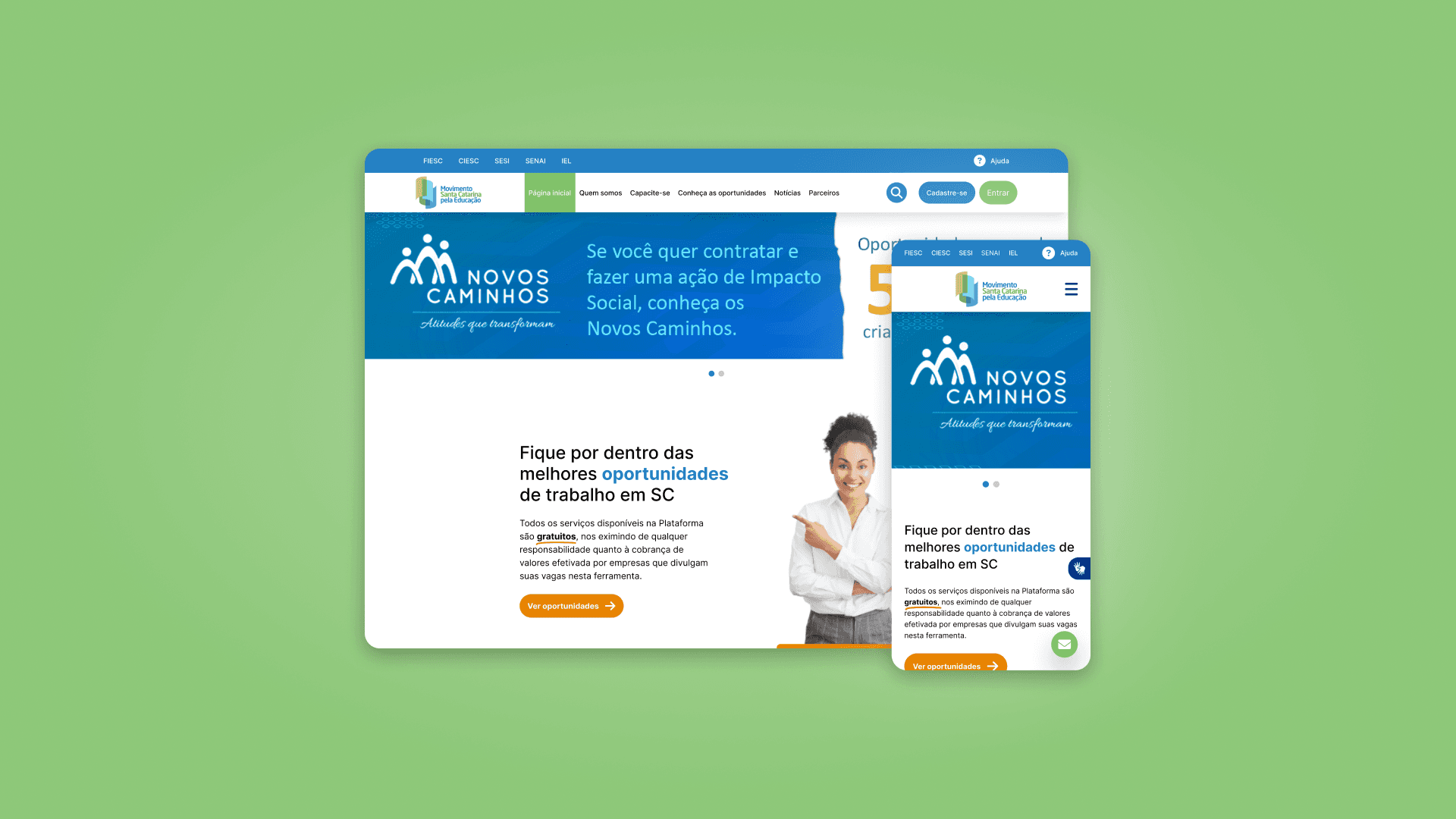
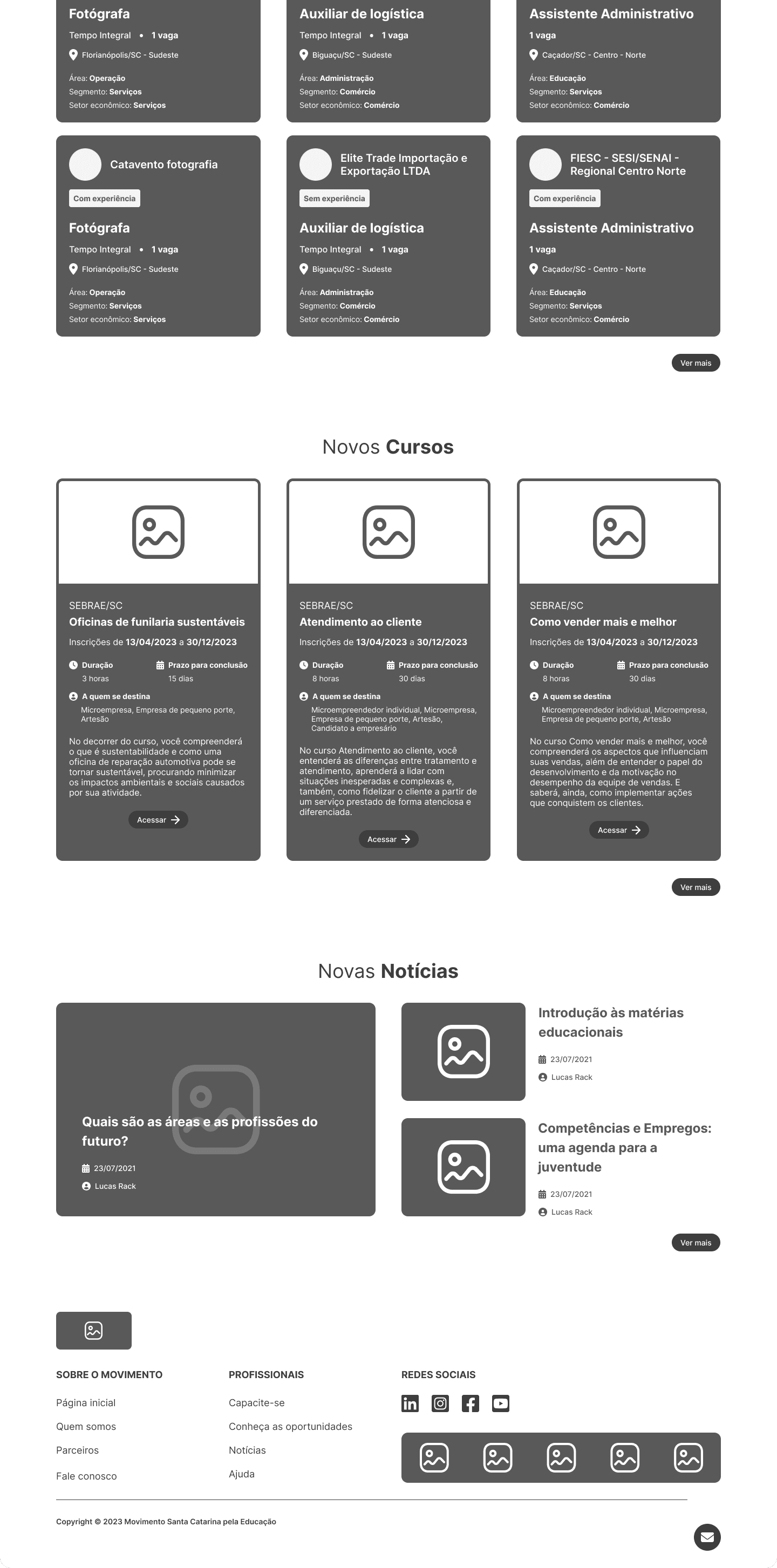
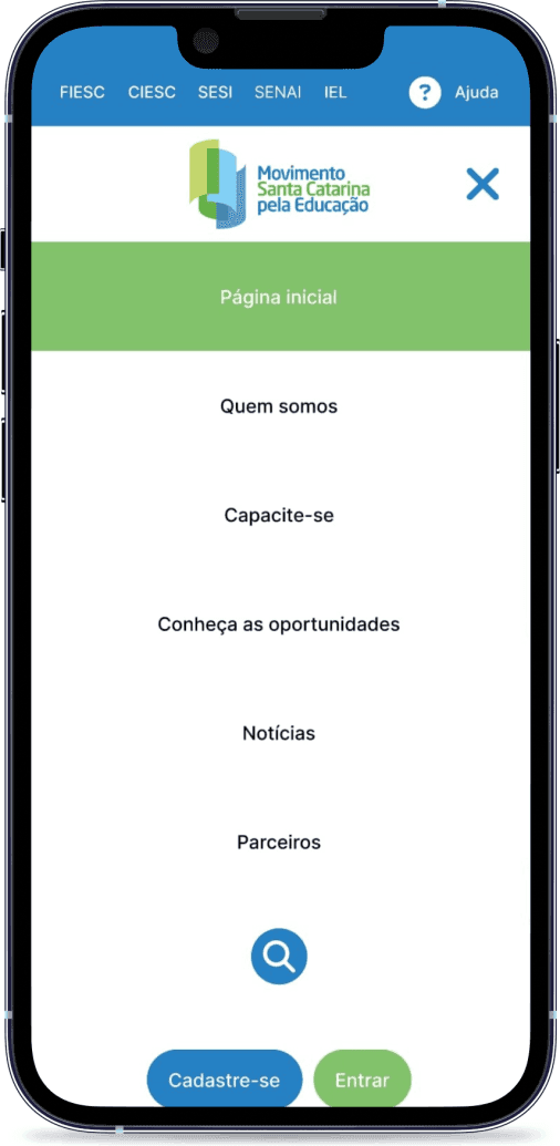
While browsing the home page and other pages of the site, I found some issues that bothered me and could be improved, including some usability problems and also aesthetic ones.
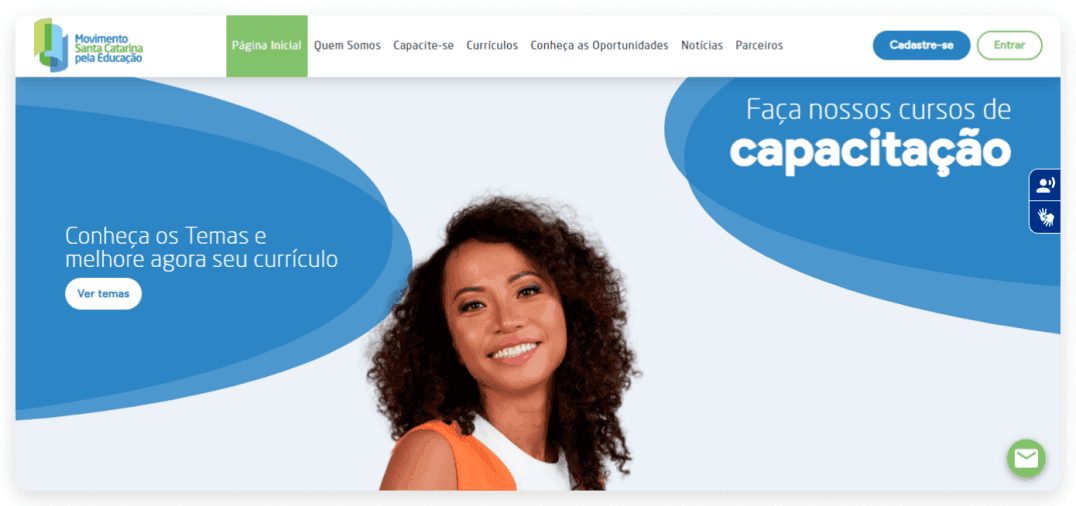
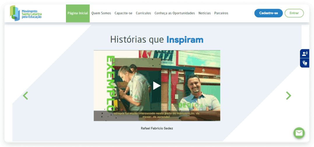

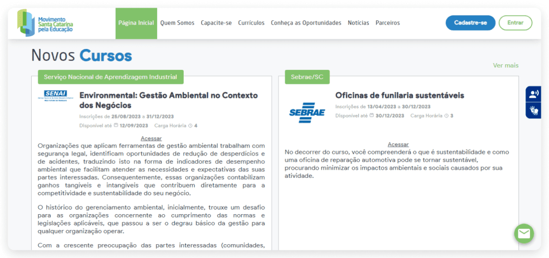
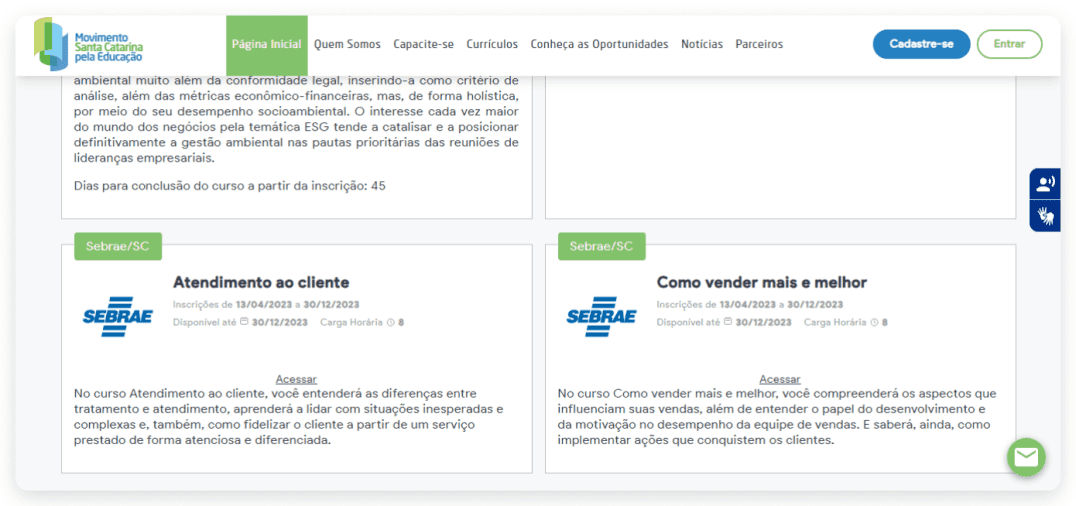
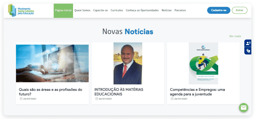
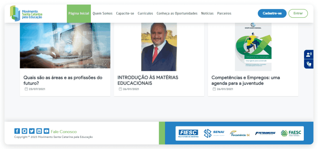
Current interface (Jul/2023) of the Movimento SC Homepage
For this challenge, it was necessary to understand what the current problems of the page were and how they could be improved. A very commonly used method to check usability issues in interfaces is heuristic analysis, as it allows us to evaluate and classify the problems found so that we can think of improvements.
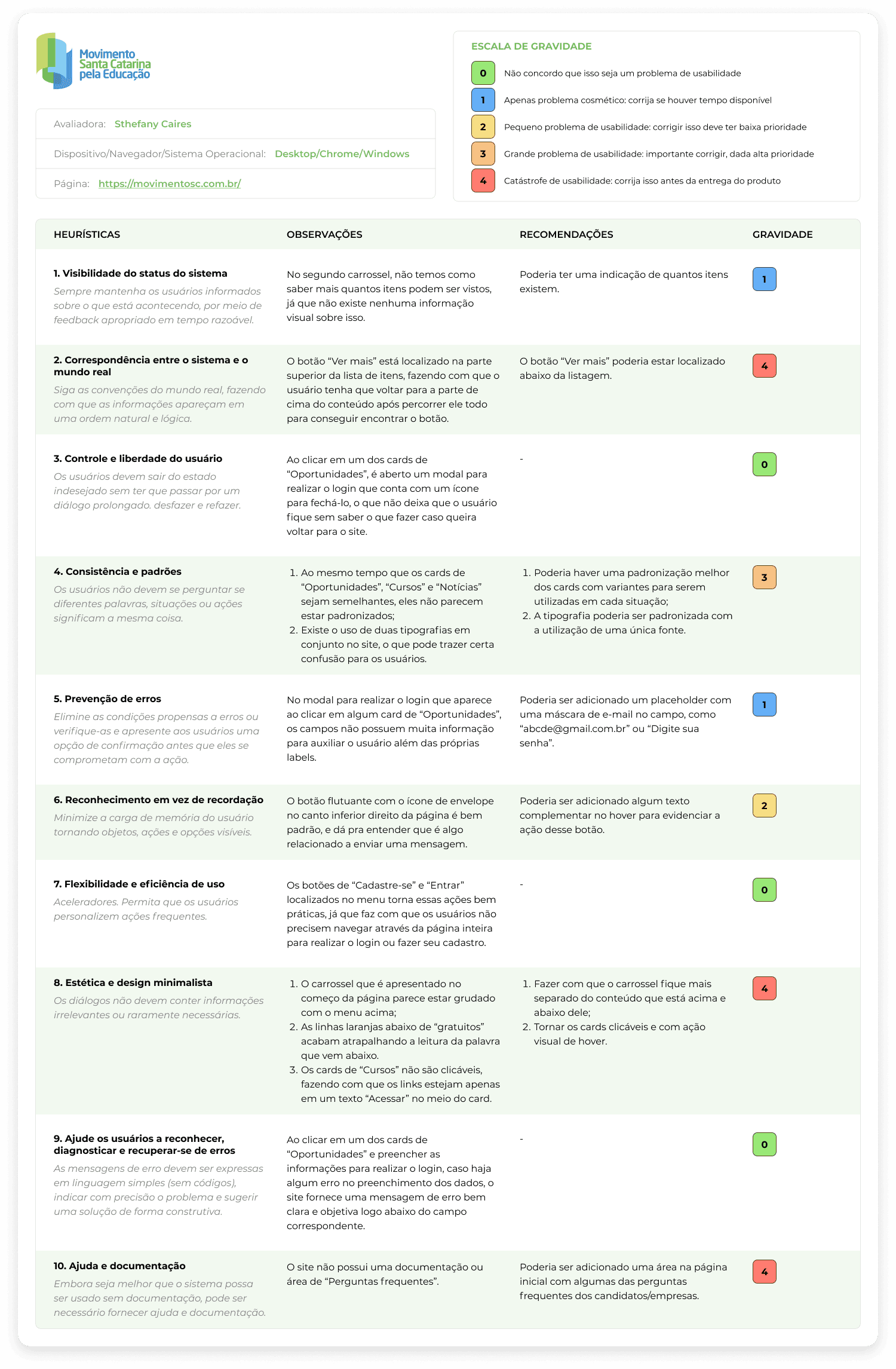
For better viewing, access the PDF version of the Heuristic Analysis.
After conducting the heuristic analysis, it was important to understand how other users interacted with the page and what issues they identified. To achieve this, a usability test was conducted with 4 users, and through the responses obtained, it was possible to gain several interesting insights:
2 of the 4 users demonstrated/felt:
Confusion with the menu item "Resumes";
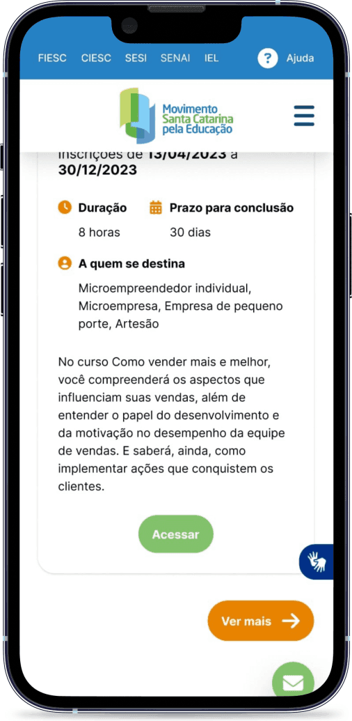
Confusion with the "Access" link on the course cards;
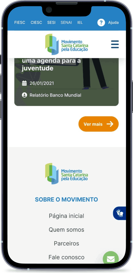
Dissatisfaction with the placement of the "See more" button in the sections;
Break of continuity between the initial and final sections;
Confusion about the "Contact us" button.
3 out of 4 users demonstrated/felt:
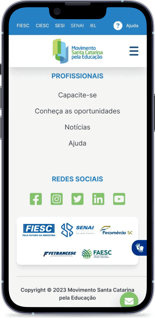
Missing information in the footer.
All users expressed/felt:
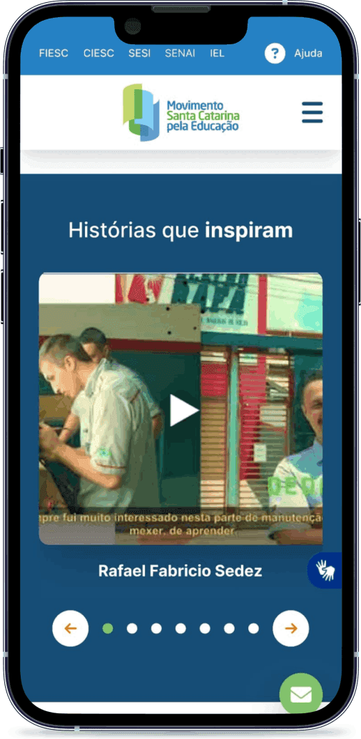
Dissatisfaction with the carousel;
Dissatisfaction with the orange line below the word “free”;
Dissatisfaction about the carousel in the mobile version;
Dissatisfaction about the images and sections in the mobile version.
To view the complete documentation, access the PDF version of the Usability Test.
Just as understanding the pains and needs of users is important, it is also necessary to know and analyze competitors, as they can provide insights and inspiration to solve the identified problems and improve the interface. To do this, a market research was conducted, where the following aspects were analyzed:
Layout;
Typography;
Colors;
Icons and graphic elements;
Navigation/interaction;
Other relevant elements.
The selected sites for the analysis were: Ayrton Senna Institute, CIEE, Vagas.com and Catho.
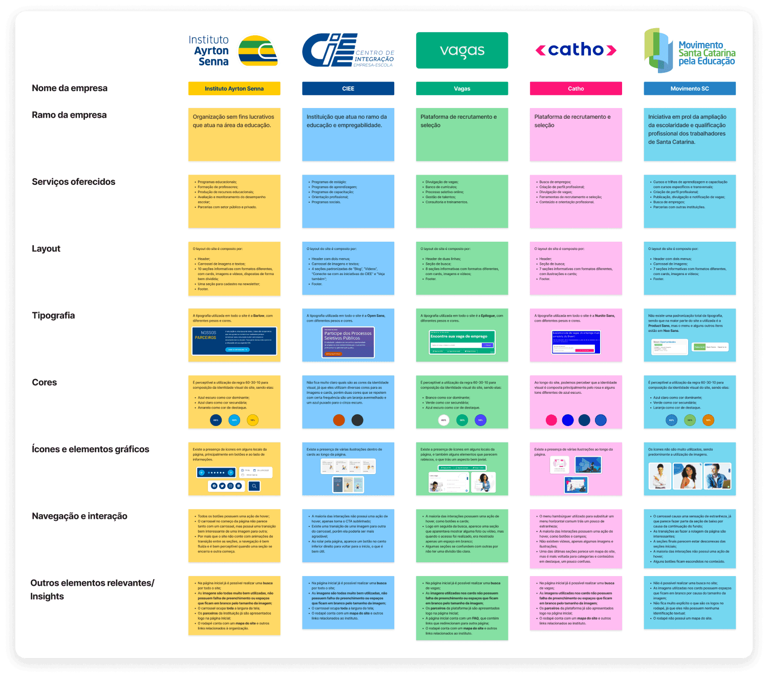
For a better view, access the PDF version of the Market Research.
📋 Definition
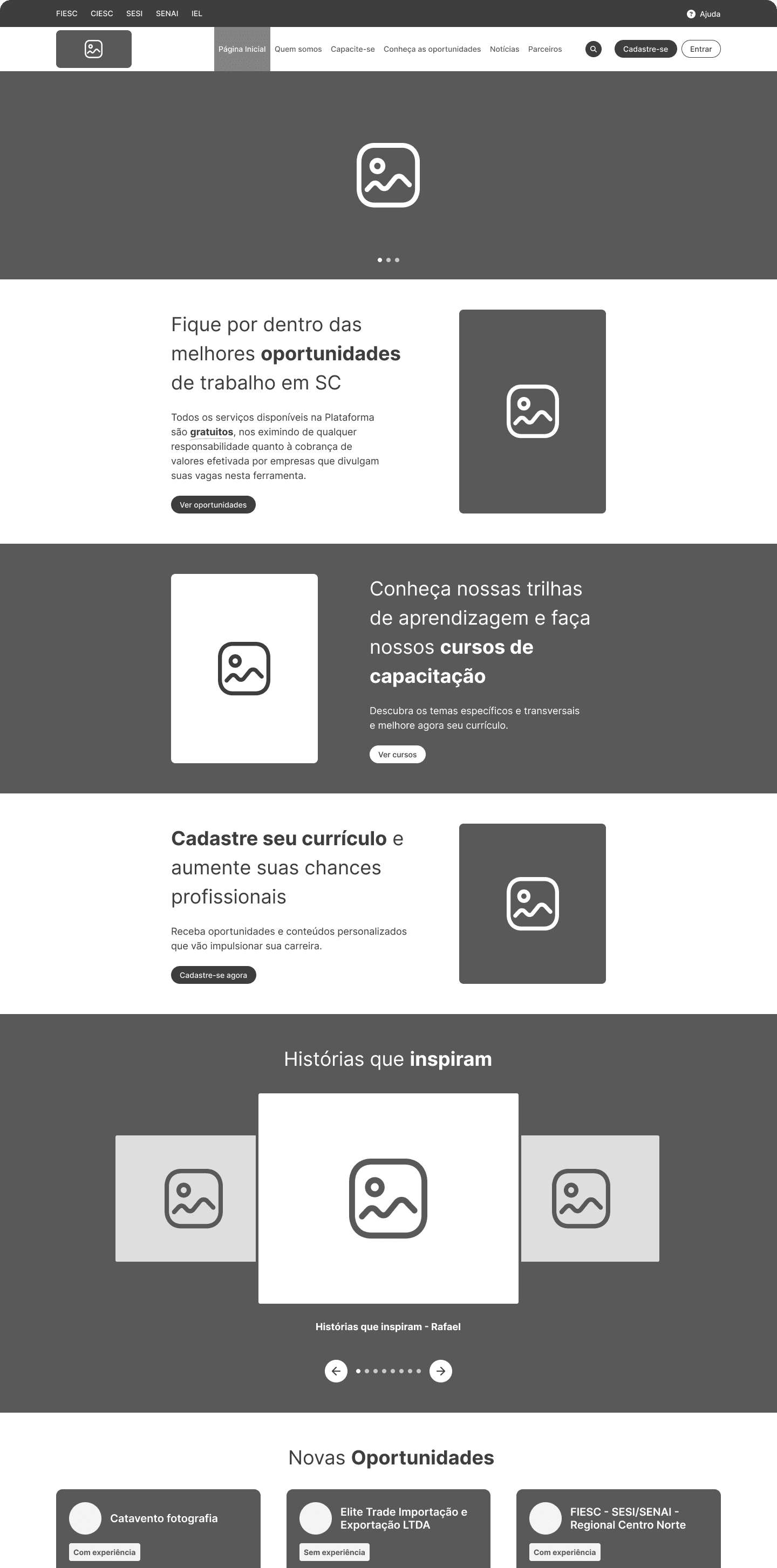
Proposal of solution
Based on all the data obtained through heuristic analysis, usability testing, and market research, it was possible to map what the proposed solution would be that will be applied in the construction of the prototype.
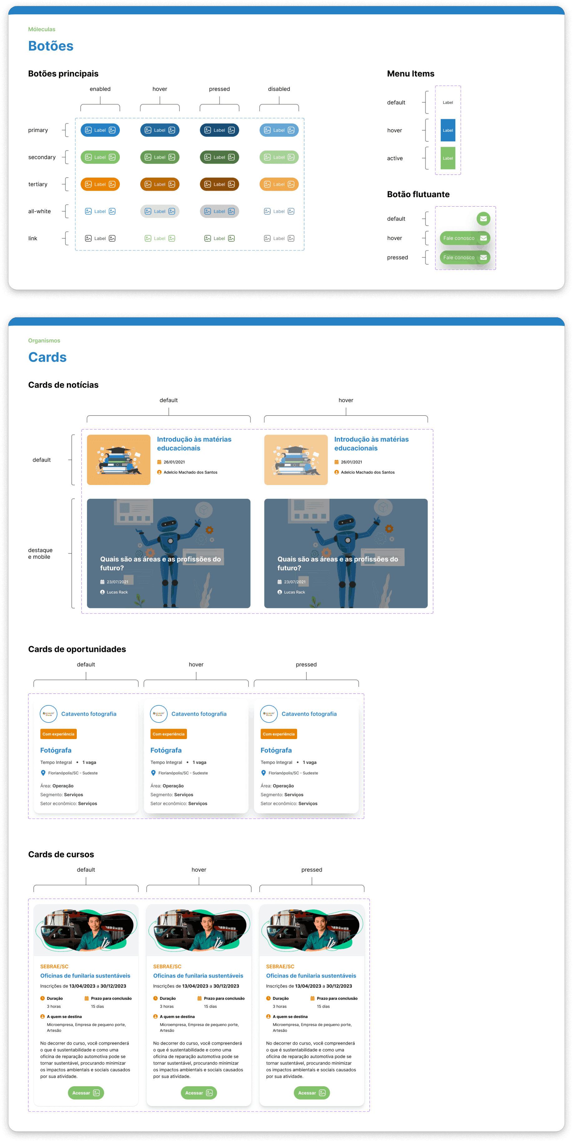
Actions to be taken:
Make improvements to the first menu;
Hide the menu item “Resumes”;
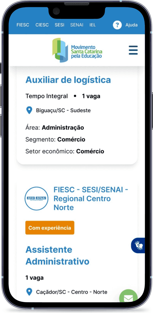
Standardize the page grid;
Add a search feature on the page;
Make changes to the image carousel;
Improve text visibility;
Display how many items are in the video carousel;
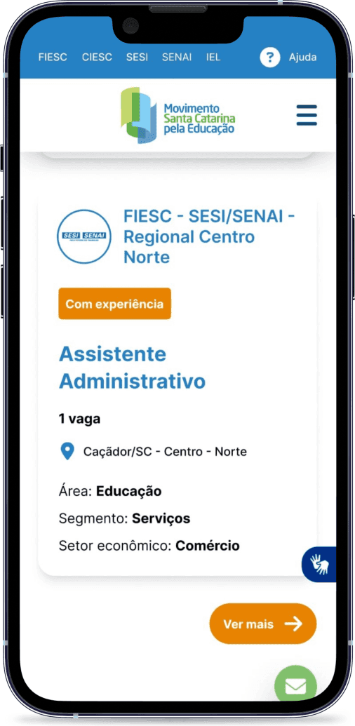
Change the positioning of the “See more” button in the sections;
Standardize cards and typography;
Add complementary text to the floating button;
Add hover actions to interactions;
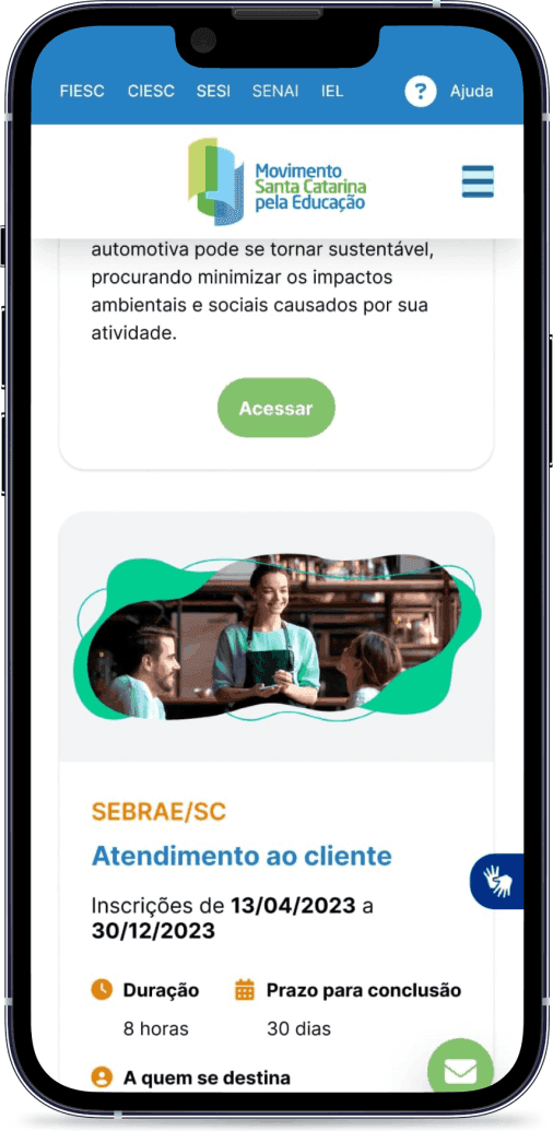
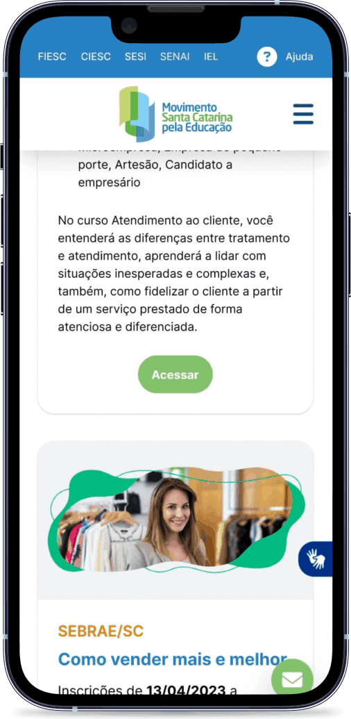
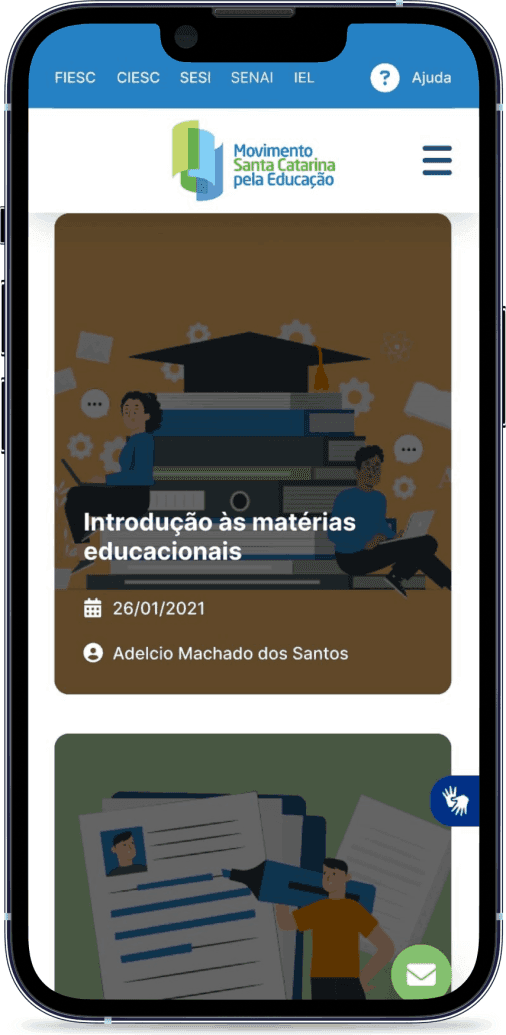
Fix the images for “News”;
Make changes to the footer.


