vegthaís - Graphic Design Study
vegthaís - Graphic Design Study
This case is about the creation of a visual identity for a fictitious company in the vegan trade.
A name needs to be simple, original, easy to understand and identify, easy to use and pronounce. The name chosen by the client, “VegThaís”, fits all these criteria, and for that reason was kept.
#ForEveryoneToSee
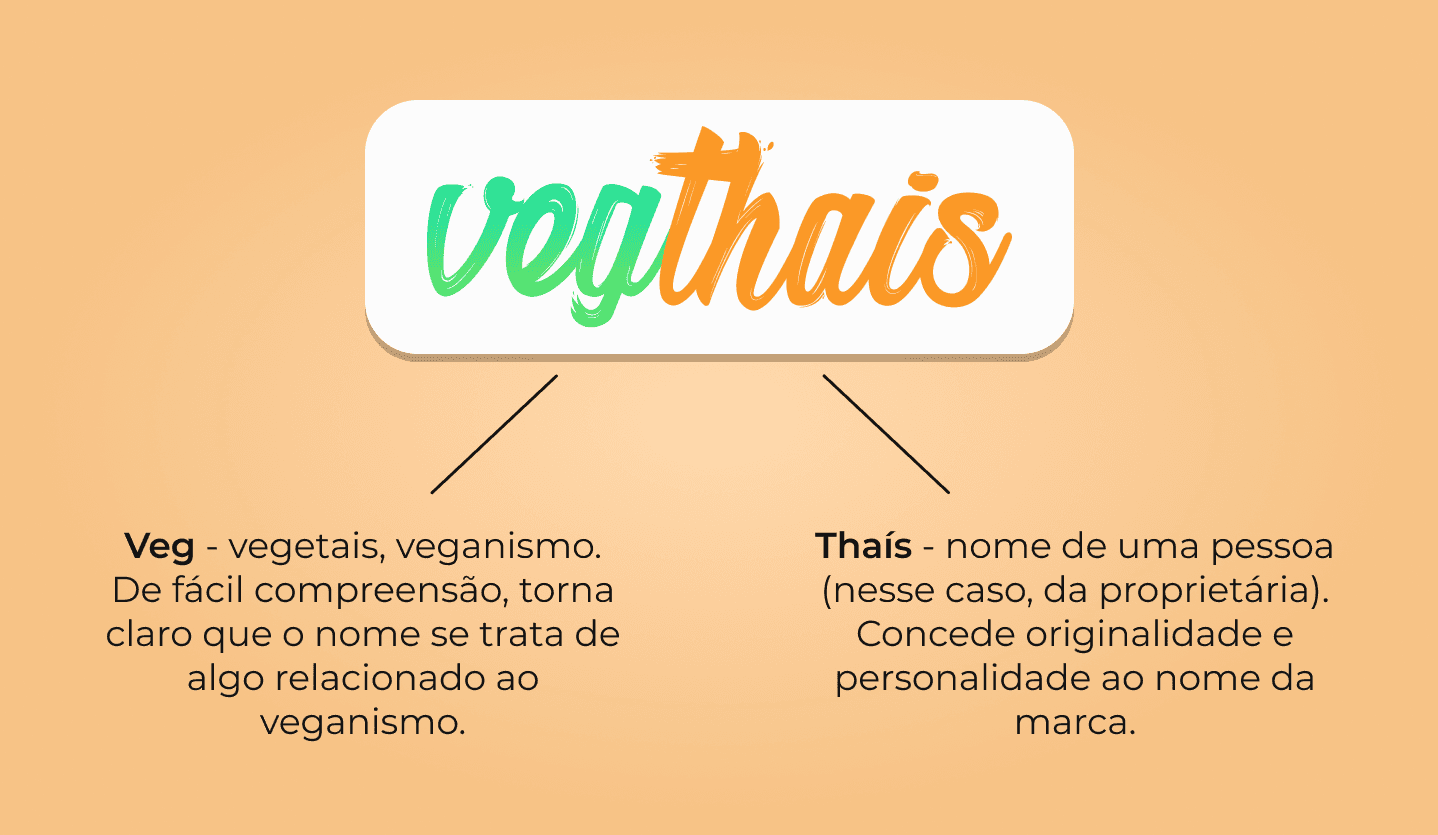
Veg - vegetables, veganism. Easy to understand, it makes it clear that the name relates to something regarding veganism.
Thaís - name of a person (in this case, the owner). It gives originality and personality to the brand name.
Explanation behind the name "VegThaís"
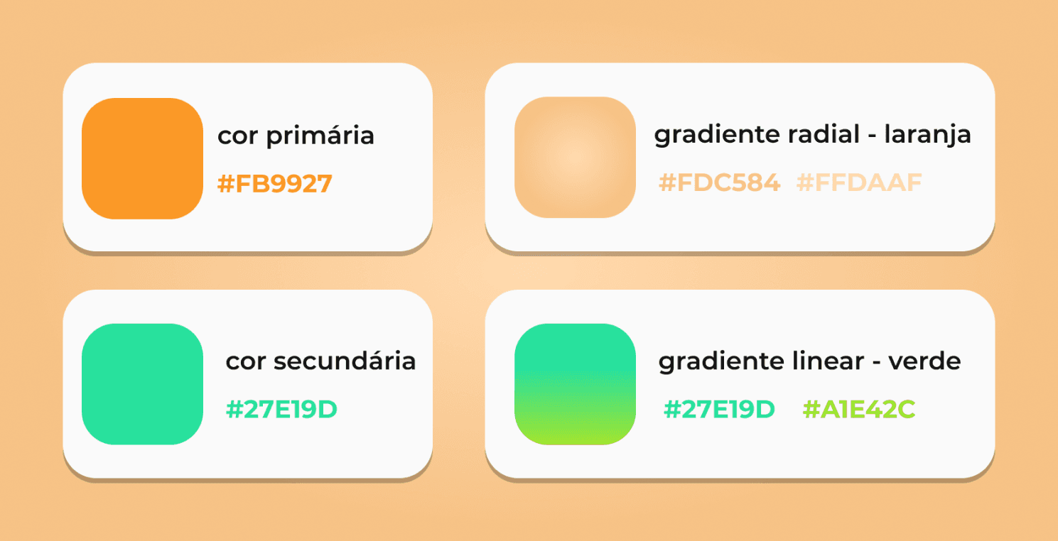
Initially, the colors chosen by the client would be red and yellow (inspired by McDonald’s).
However, logos with similar colors, even in services from different companies, can end up causing confusion for customers.
Since that is not what we want, orange and green were selected to be the main colors of the brand's visual identity, with orange being a mixture of the colors originally chosen and green referring to veganism.
Colors of the visual identity
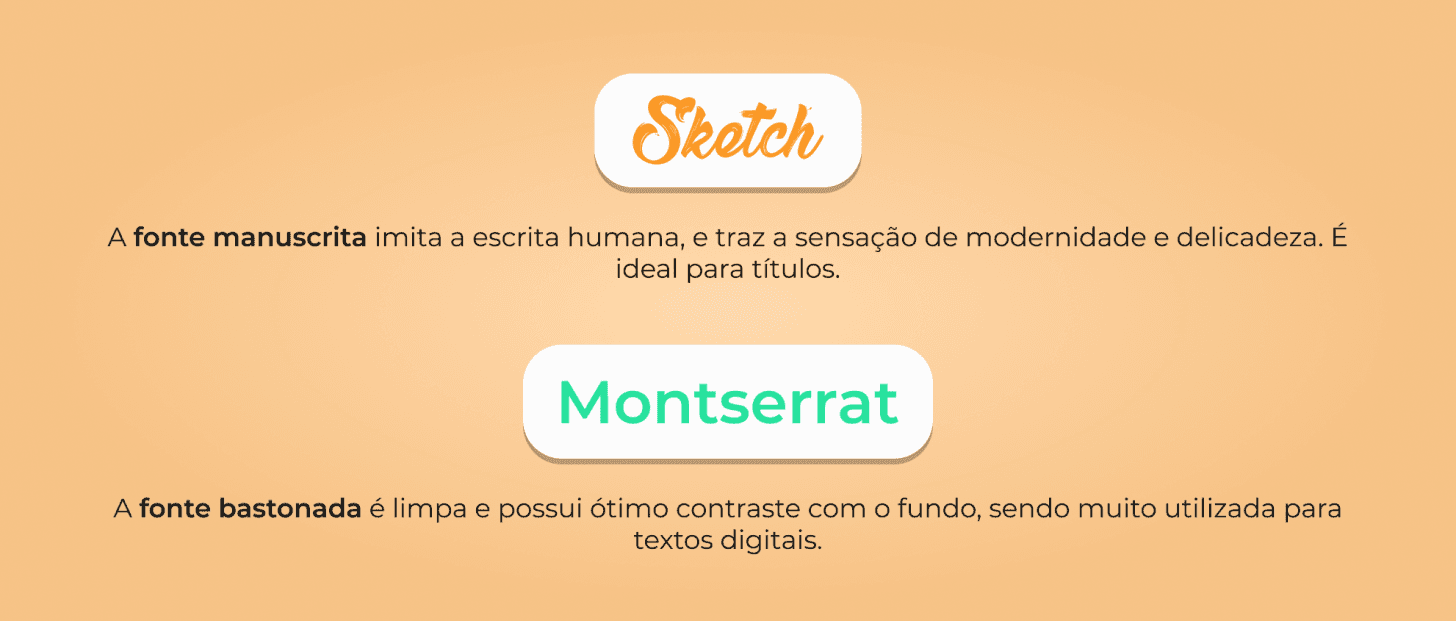
The Sketch (handwritten) and Montserrat (sans-serif) fonts were chosen for the overall visual identity of the brand because they form a combination of contrasting fonts, making the information better organized.
The logo being written entirely in lowercase is part of a style that seeks more durability and modernity for the brand.
#ForEveryoneToSee
Sketch - the handwritten font mimics human writing and brings a sense of modernity and delicacy. It is ideal for titles.
Montserrat - the sans-serif font is clean and has great contrast with the background, being widely used for digital texts.
Explanation behind the chosen fonts